Renewal Logo Design

New design of brand logo
We re-designed the brand logo.
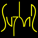
Old logo designed with line-art of the letters of “S U Z H A R”.

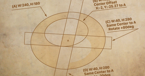
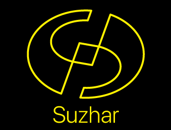
In other hands, new logo designing with shape of the letter “S”. The round outline shape represent omnidirectional activities, and the central diamond shape represent our core value.

The key color is yellow and black (as same as old one), but it can be used for a wide range of applications such as changing the color and size, and using it as a clipping area.

We will continue to work to become a brand logo that is recognized and familiar to many people.