Brush up the logo
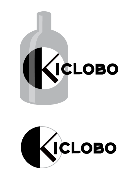
The Kiclobo logo has been slightly brushed up.

Logotype is changed to the original one with an image close to the symbol K.
We’ve also placed highlights on the bottle shape to make the symbol appear to be inside the bottle.
In addition, bottleless variations for small display areas have also been facilitated.
We are also designing products that use the logo so that we can quickly develop them.